
High-performance WinUI Datagrid control
List of Services
- Grid features such as tabular data editing, sorting, filtering, and grouping
- Take your WinUI data grid to the next level with on-demand loading, custom cells, native editor controls, adaptive column layouts, selection, and export.
- The No. 1 UI component loved by WinUI developers worldwide
Why Choose FlexGrid for WinUI ?

Ask anything!
Share your concerns and questions about ComponentOne with MESCIUS's expert team. We empathize with your concerns and are here to help.
WinUI Datagrid Key Features
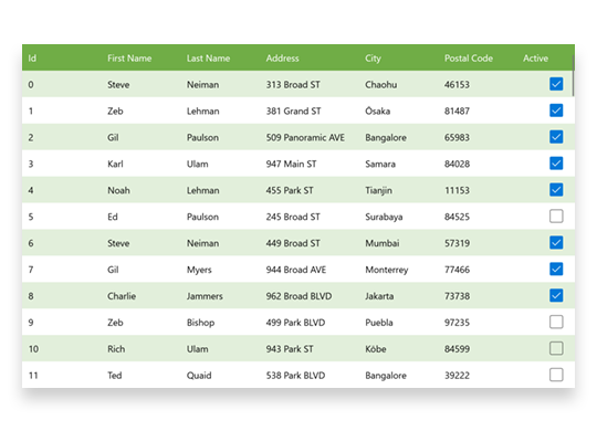
Data bound/unbound
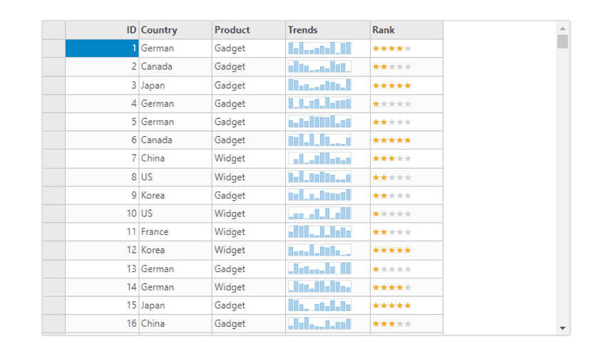
Get started quickly with automatic column generation when data binding to .NET data source objects or custom business objects. Create custom columns with images, numeric input, date, time, or whatever your application needs. FlexGrid also supports an unbound mode, giving you complete control over creating each row, column, and cell value.
Loading Large Data Sets in WinUI
On-Demand Loading and Data Virtualization
Virtual mode allows you to load data on demand by retrieving only the data visible to the user, improving performance for large datasets. The C1DataCollection component supports FlexGrid data virtualization.
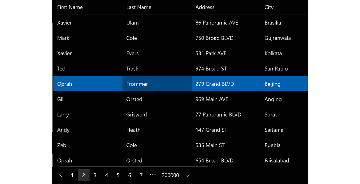
WinUI DataGrid Paging
Navigate large datasets seamlessly with paging. Present large datasets to users in chunks or pages. Set page length and scroll back and forth through various pages.
WinUI Data Grid Custom Cells
-
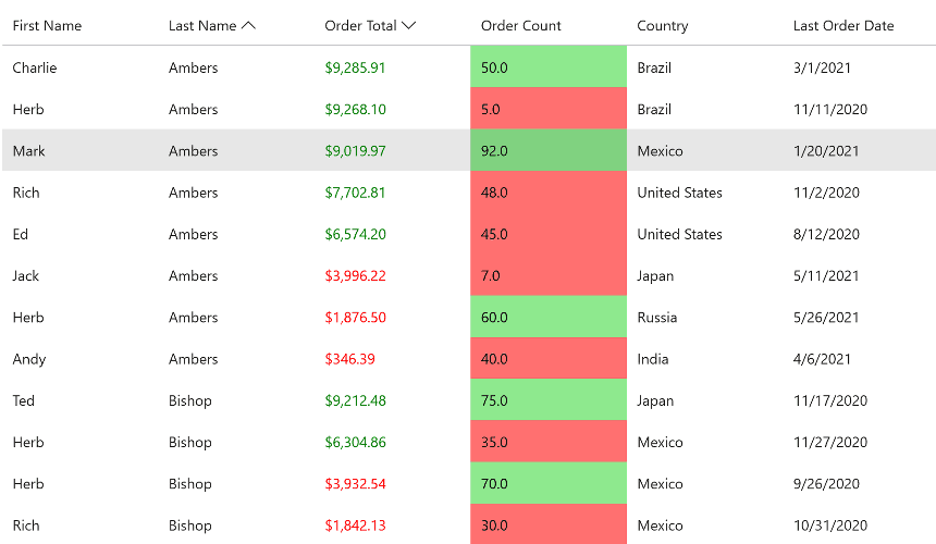
Conditional Formatting
Highlights values that meet criteria. Provides a powerful cell formatting API.
Learn More -
-
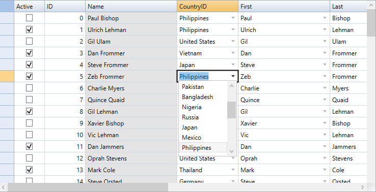
Cell Editor
Supports efficient in-cell editing for numbers, dates, checkboxes, and data mapping combo boxes.
Learn More
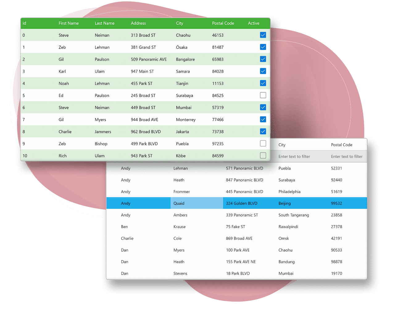
Filtering WinUI data
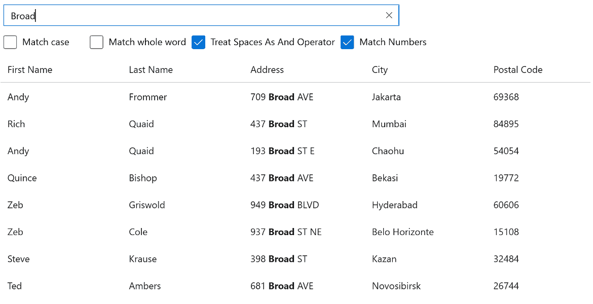
Search
FlexGrid allows you to perform full-text filtering or search on your data, displaying all matching instances found in the data grid. Search the entire grid or just specific columns, then highlight all matching items.
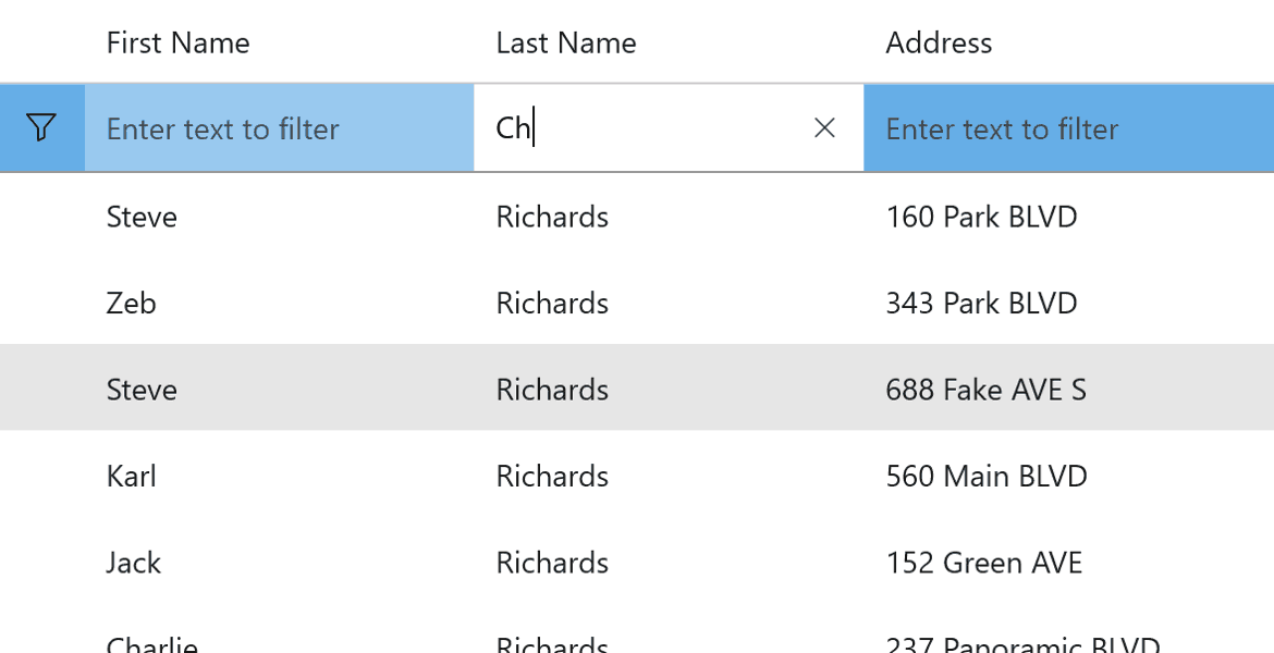
Filter Row
Display a traditional filter row at the top of the WinUI datagrid to allow filtering on multiple columns.
Grouping and Aggregating WinUI Data
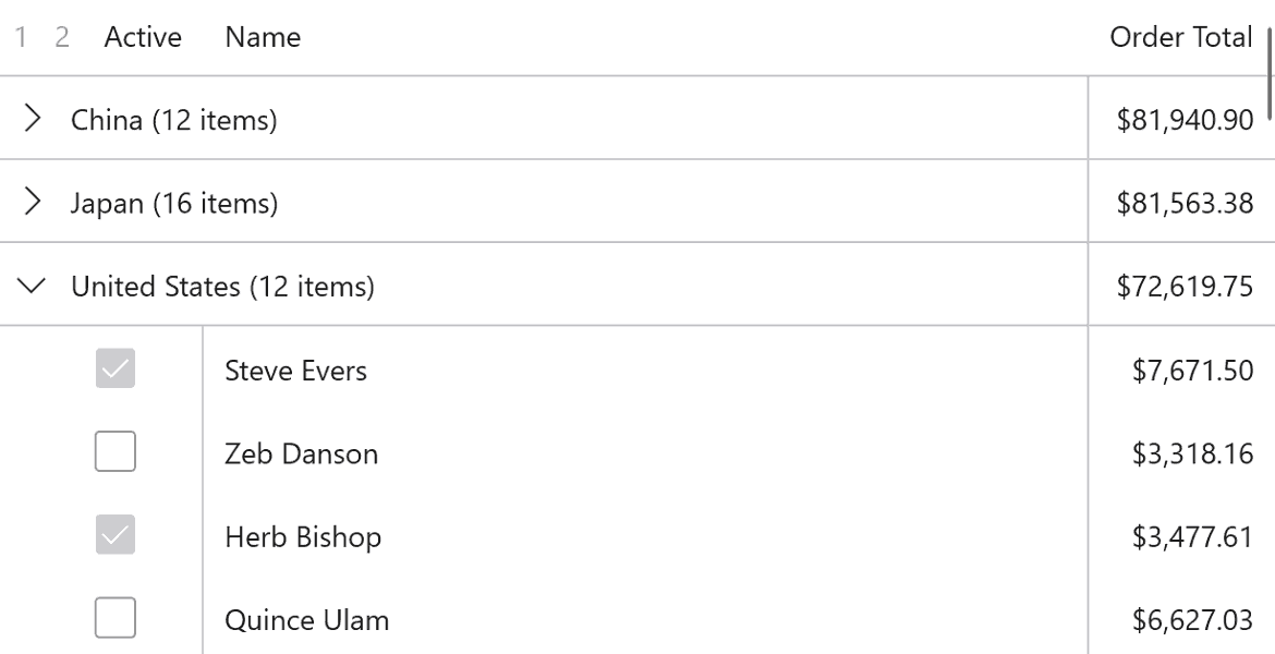
Support analysis of large datasets through runtime data grouping. You can display grouped data with customizable group headers and aggregated values. Grouping in FlexGrid is supported through the C1DataCollection component.
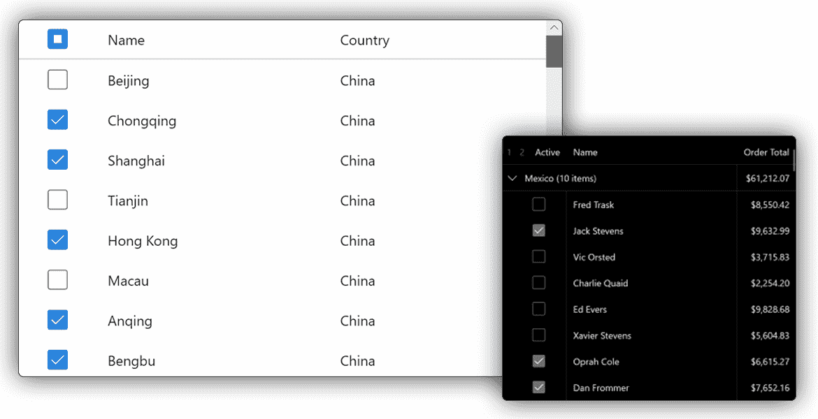
Select WinUI Data Cells
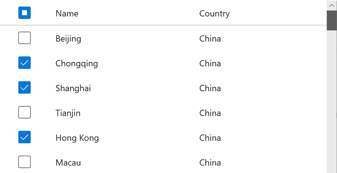
Select Cell
FlexGrid supports several selection modes, including cell, cell range, row, and row range selection. Provide drill-down or additional analysis on user selections. Enable checkbox selection and a customizable mouse-over style.
Hover style
Highlight cells as the end-user hover over them with the mouse. Configure the hover cell style to appear over single cells, entire rows, or entire columns.
WinUI Drill-Down Row Details

Drill into a row of data to show more details inside a collapsible panel. Collapsible row details provide an alternative approach to displaying additional or hierarchical information about a data row. Load row details on-demand–reducing the amount of data needed to render the initial WinUI datagrid.
WinUI Real-Time Data Updates

Create live datagrid displays and dashboards with automatic updates. Show stock prices and other rapidly updating information in your datagrid. Live updates to the underlying data can animate at runtime in WinUI.
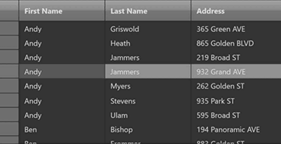
WinUI Styling & Appearance
Provide a custom skin or theme for your WinUI datagrid by simply setting properties – no need to modify the complex XAML templates. Quickly change brushes for selection, mouse-over, column headers, row headers, and alternating rows. FlexGrid for WinUI also supports light and dark themes, so you can easily skin your entire application.
Transposed WinUI Data Grid
The transpose WinUI data grid flips rows and columns, with headers displayed on the lower left and rows filling the entire screen. Simply add a single line of markup to enable the transpose feature in FlexGrid.
Ask anything!
Share your concerns and questions about ComponentOne with MESCIUS's expert team. We empathize with your concerns and are here to help.
Explore the many features of the WinUI data grid.

Column Reordering
You can change the column order by dragging and dropping headers. Save and maintain layouts for future use.

Cell Merging
FlexGrid supports content-driven cell merging. This allows you to merge matching adjacent cells across columns and down rows. Merge header cells, create custom cell merging rules, and set restrictions on how FlexGrid merges cells.

Adaptive Column Sizing
You can specify column sizes and resize columns at runtime by modifying the code.

Multi-Column Sorting
Clicking on the header supports sorting, ascending, and descending. WinUI DataGrid also supports sorting by multiple columns and customizing icons.

Row and Column Freezing
Provides Excel-like row and column freezing functionality, allowing users to keep rows and columns in view while navigating the contents of a DataGrid.

Add New Row
Add a new row to the database with a tap or click. Adding a blank row to the WinUI datagrid at the top or bottom allows users to add more rows of data.

Edit Confirmation
Inline editing makes it easy to modify any cell by double-clicking quickly. Prevent erroneous edits to the data with edit prompts and confirmation for the end-user.

Pop-Up Edit Form
You can edit a WinUI DataGrid using a popup form window.

Export
Save your WinUI grid to common formats, including CSV, text, and HTML.
ComponentOne WinUI Free Trial
ComponentOne Enterprise
Expand your development reach across all .NET platforms with ComponentOne Enterprise.

