
InputPanel
List of Services
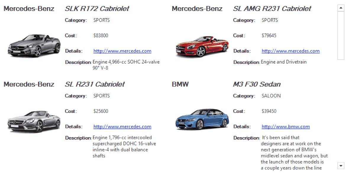
A complete data entry form with a single input control
- Available for WinForm, WPF, and UWP
Why Choose InputPanel?
Key Features of WinForms Input Form
Instant Form Generation
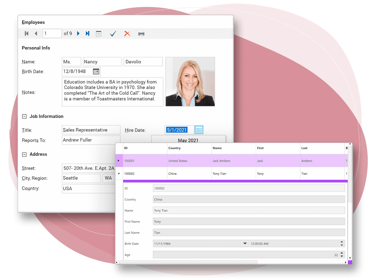
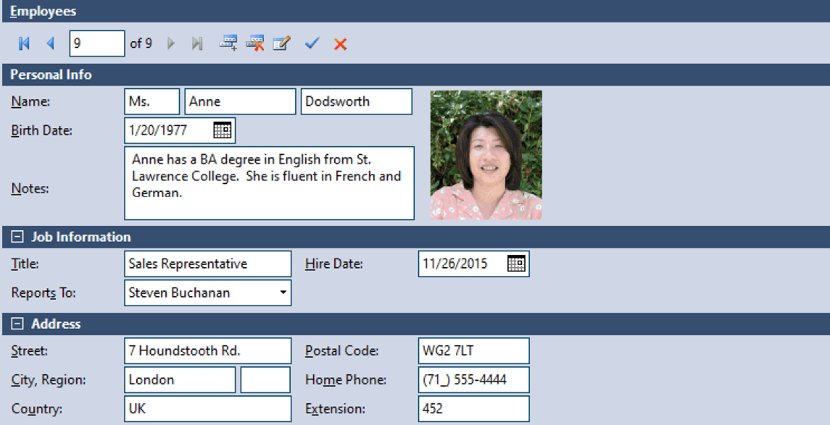
When you set up an InputPanel data source, each input control is automatically created with its own label. A navigation bar is also added to the form, allowing end users to navigate and update records.
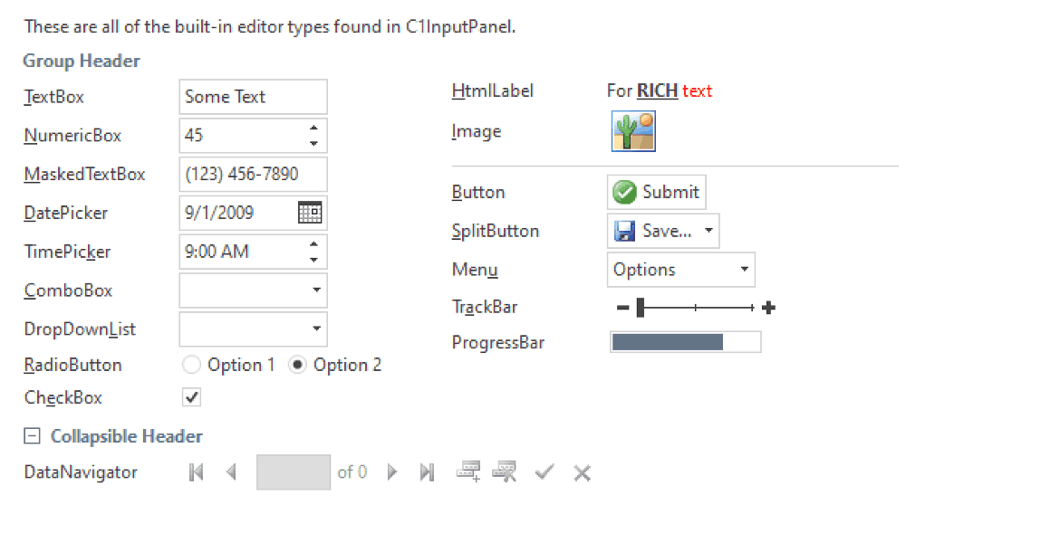
20 Built-in Editors
InputPanel automatically selects each input control based on its data type, but you can override this and choose from 20 built-in editors. You can also host your own custom controls and add images, separators, and more.
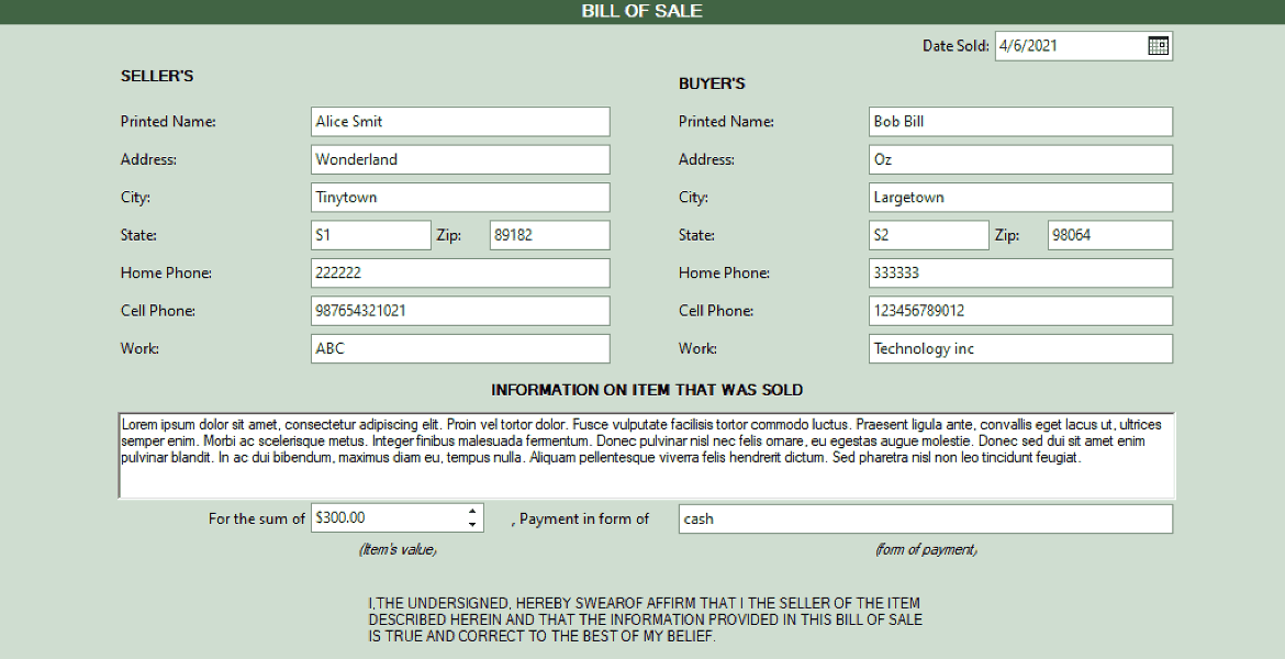
Multi-Column layout
WinForms input forms flow from row to row. You can interrupt the stacked flow at any time to create a multi-column layout. Scroll bars automatically appear to ensure the layout is always accessible.
Grid & Flow Layout
Create a layout that flows from left to right by setting a single property. Or, align items in a grid without worrying about scaling when resizing the form.

Ask anything!
Share your concerns and questions about ComponentOne with MESCIUS's expert team. We empathize with your concerns and are here to help.
Learn More About InputPanel Features
Add a Complete Data Entry Form with One Line of Code

Automatic tab order
InputPanel automatically sets the tab order, allowing end users to tab naturally from item to item at runtime.

Accelerator Keys
When a form is populated with fields from a data source, an accelerator key is automatically generated. Use the Key Accelerator Editor to manage key duplication.

Tooltips
Use tooltips to provide users with useful information about form fields. Easily design rich tooltip content using images and HTML.

Validation and Error Handling
If the user enters invalid input, a visual warning is displayed. By default, the warning is a red frame around the input control. You can also add custom notifications, such as tooltips.

Group header
Group input fields into categories and allow users to expand or collapse the groups at runtime.

Supports over 40 themes
Choose from over 40 included themes or customize your own using C1ThemeController.
InputPanel Demo
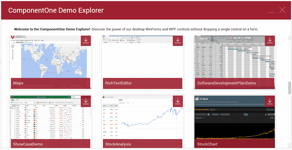
Download the Control Explorer application for .NET Framework or .NET 6+ to see all the features and demos of InputPanel!
ComponentOne Enterprise Free Trial
ComponentOne Enterprise
Expand your development reach across all .NET platforms with ComponentOne Enterprise.

