
Powerful JavaScript Input Components
Wijmo's wide range of input components meets the needs of any application.
- Create and enter data quickly and efficiently using mouse or touch
- Specialization and optimization by data type
- Supports Angular, React, and Vue
Wijmo's input components are designed to enable easy and efficient data entry using a mouse or touch. Wijmo's diverse input components, specialized and optimized for each data type, meet all your application needs.
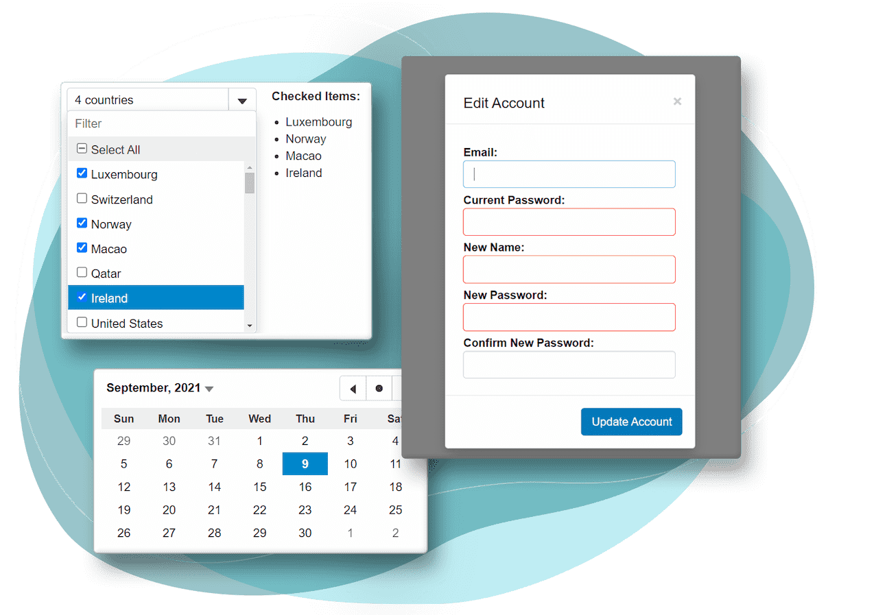
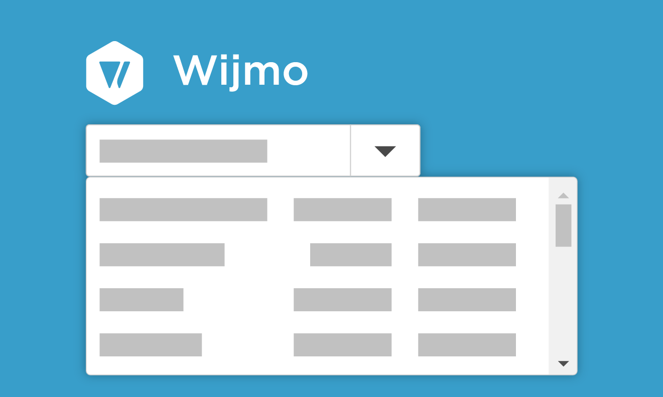
JavaScript Dropdown Input Control
-
DropDown
The DropDown component is an abstract class used as a base for several components. It consists of an input element, a dropdown button, and a dropdown element.
-
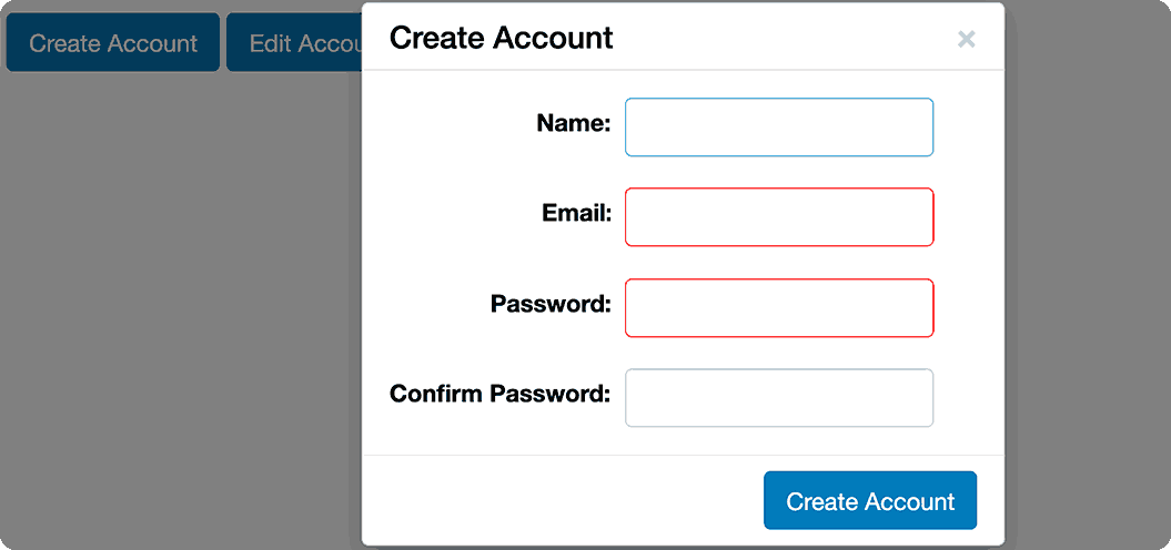
ComboBox
Wijmo's JavaScript ComboBox component lets you select and edit both strings and objects in a list. It includes features like number and date support, multi-column dropdowns, and custom HTML content.
-
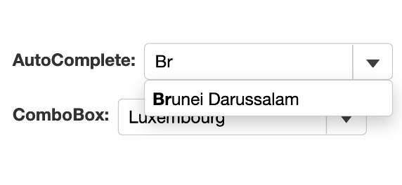
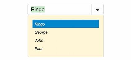
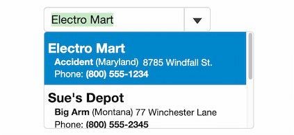
Autocomplete
Expand functionality by automatically filtering dropdown items based on user input. Customize search parameters, filter features, and integrate asynchronous loading when loading large data sets.
-
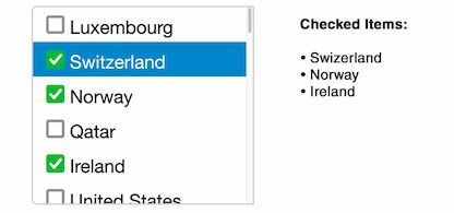
ListBox
Displays a list of items containing plain text or HTML and allows the user to select items using the mouse or keyboard. ListBox supports multiple selections and item templates, as well as a string array or object array for the itemsSource.
-
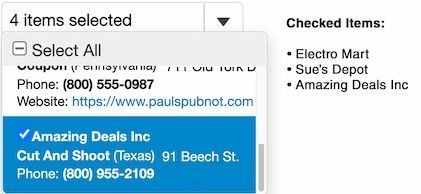
MultiSelect
Extend the ComboBox control and add a checkbox to each item in the drop-down list. Customize the cells of the MultiSelect control by setting the items to be checked based on properties within the object and setting custom HTML.
-
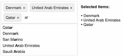
MultiSelectAutoComplete
The user can select multiple items from the control's data set. The control displays a drop-down menu that matches the control's current input and displays the currently selected item.
JavaScript Date and Time Input Controls
-
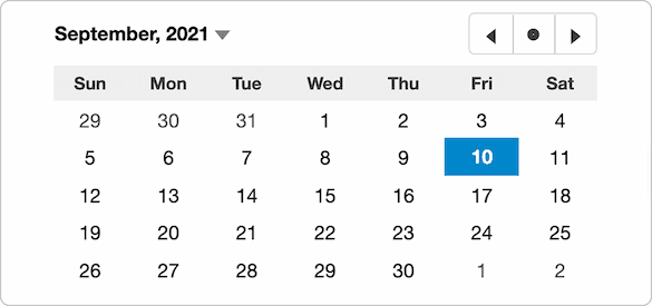
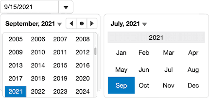
Calender
Set a date range from which users can select, confirm user selections, and customize each date cell within the calendar.
-
InputDate
Select a date by entering a date value in the drop-down control or by expanding it and selecting it from the Calendar control.
-
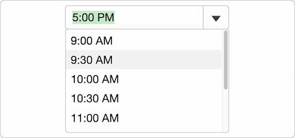
InputTime
Wijmo's InputTime control extends the ComboBox class to allow easy entry and editing of time values.
-
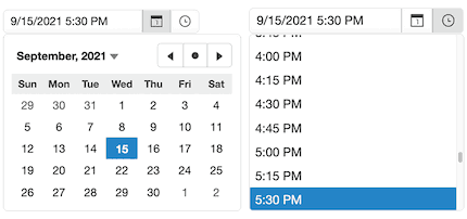
InputDateTime
Extend the InputDate control to allow users to select from a range of dates and times. Users can either enter a date and time in the input element or expand the dropdown and select a value from the dropdown list.
-
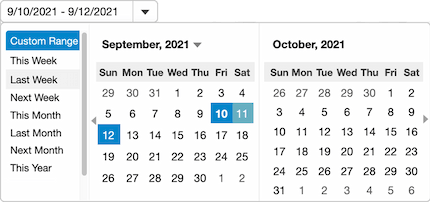
InputDateRange
The InputDateRange control extends Wijmo's InputDate control and configures it to support editing date ranges. You can specify a custom date range for users to select, or use a multi-month calendar in the dropdown to select a date range using the mouse or keyboard.
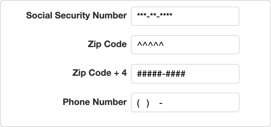
JavaScript Numeric Input Control
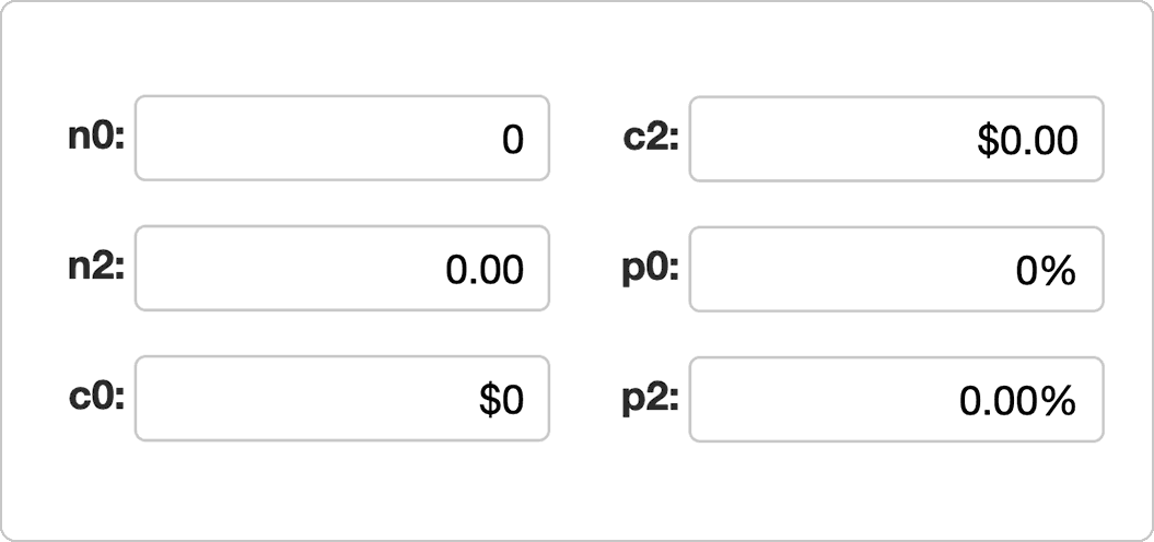
The InputNumber control is an input control that allows users to enter and edit numbers. You can format the number, set step values to increase or decrease the control's value, and set minimum and maximum ranges for the values that can be entered.
JavaScript Menu Control
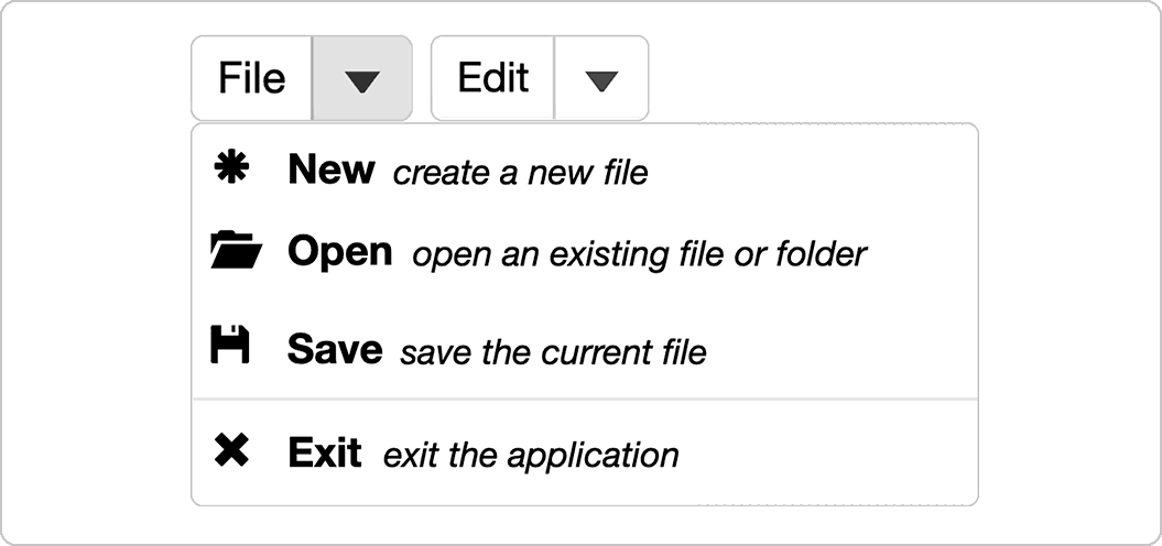
The Menu control extends Wijmo's ComboBox class, adding features such as a non-editable header, an itemClicked event, and commands. This allows you to attach methods to the control that execute based on the selected element in the menu.
JavaScript Color Picker Control
Wijmo's JavaScript InputColor component extends the ColorPicker control and places it in a dropdown component. This allows users to select a color by entering a hexadecimal color value into the dropdown.
Wijmo's ColorPicker control is a panel that allows users to select a color. The ColorPicker can be customized to display hexadecimal values, alpha values, and change the palette displayed to the user.

Ask Anything!
Share your vague concerns and questions about Spread.NET with MESCIUS's expert team. We empathize with your concerns and are here to help.


Ask anything!
Share your vague concerns and questions about Spread.NET with MESCIUS's expert team. We empathize with your concerns and are here to help.
Wijmo Tutorial
You can check out the demo and learn how to implement it in practice through the tutorial.
Provides code for Angular, React, and Vue frameworks.


Easily Customize Wijmo Controls!

Easily create design themes using the Wijmo CSS Theme Designer and apply the created CSS to your Wijmo controls!

Easily customize the settings of Wijmo controls using the Wijmo Control Properties Editor. You can modify and check the settings for over 20 different controls. Download these settings and quickly and easily apply them to your web without any additional coding.
MESCIUS Developer Forum
-

Wijmo Blog & Tips
We provide various information to help you use Wijmo effectively.
-

Wijmo Q&A
Please share your concerns and development knowledge with us through the Q&A space.
-

Wijmo FAQ
You can check answers to frequently asked questions.
-

Citizen Insight
This space was created to help alleviate some of the fatigue and stress you may experience while working. Feel free to communicate freely.
-

Citizen Knowledge
In addition to questions about MESCIUS products, this is a space where anyone can freely ask questions and communicate about development/technology.
-

IT Seminar/Meeting
This is a meeting space created for developers and those interested in development to develop together.


Purchase Procedure
Click on each button to see detailed information about each step of the purchasing process.
Controls for Web Developers
SpreadJS
Pure JavaScript-based Web-Excel Component
- Supports Excel import/export
- Supports 450 Excel functions
- Supports Angular, React, and VueJS
Learn More
ActiveReportsJS
JavaScript-based Business Reporting Component
- Supports Angular, React, and Vue
- Provides a cross-platform designer program
- Provides a JavaScript report viewer
Learn More
Forguncy
Build Business Web Apps with Excel — No Coding Needed
- Turn Excel features into fast, powerful web apps
- Start web development — no HTML or CSS required
- Unify and collect your business data with ease
Learn More
DsExcel
High-Performance Excel Spreadsheet API for Java, Kotlin, and .NET
- Create, load, edit, and save spreadsheets
- Parse, convert, and share spreadsheets
- Calculate formulas and format cells
DsExcel JavaDsExcel .NET

